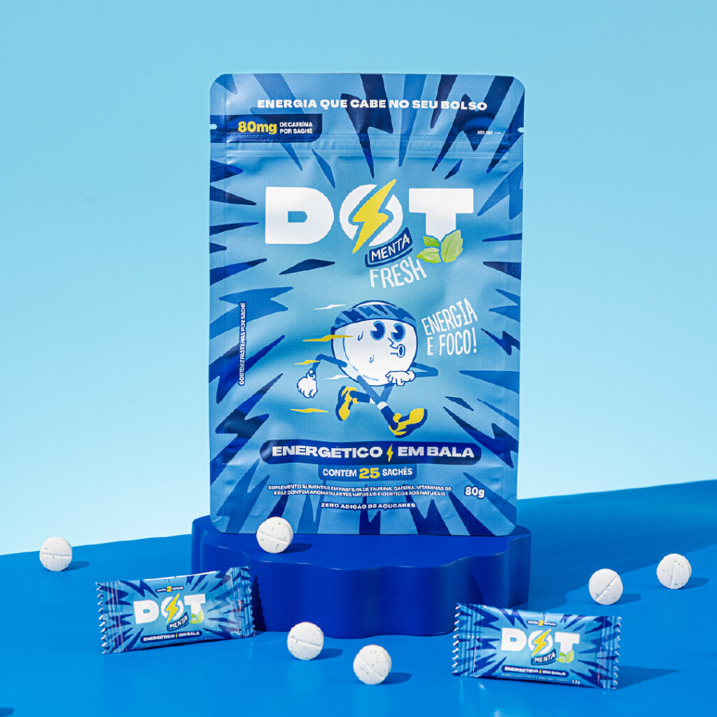
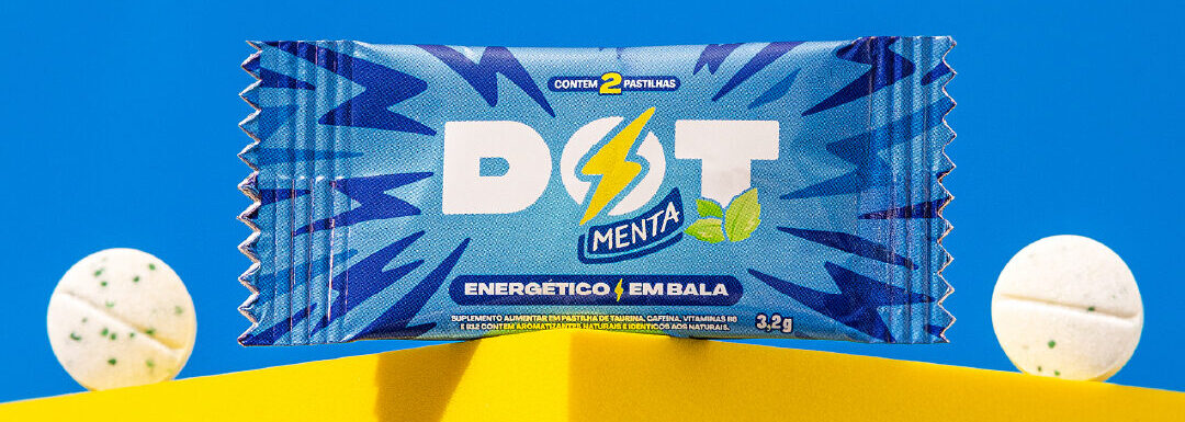
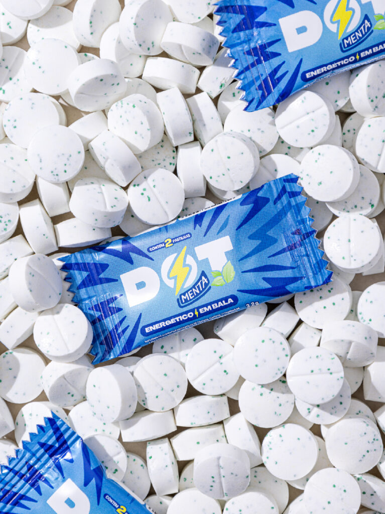
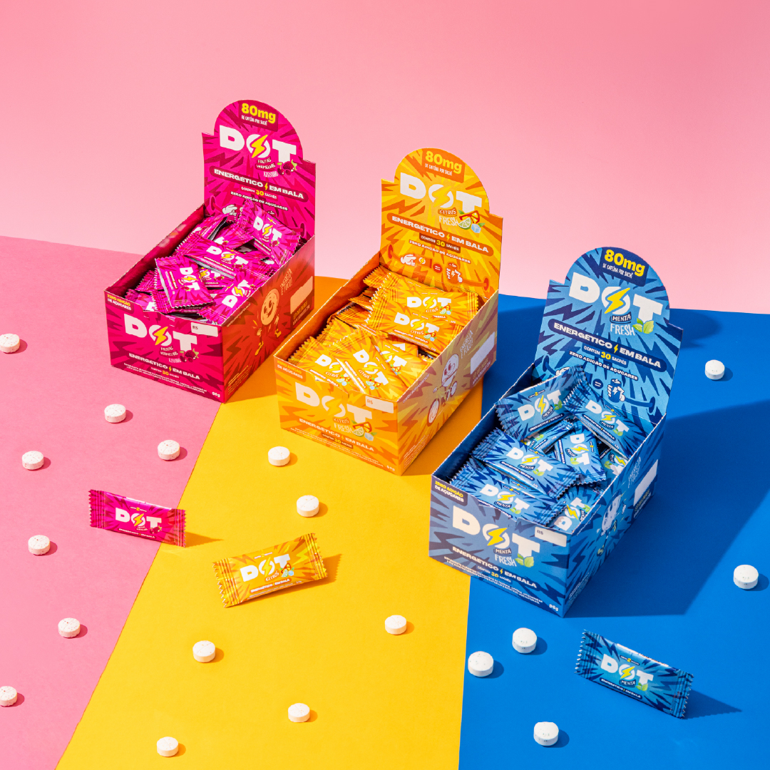
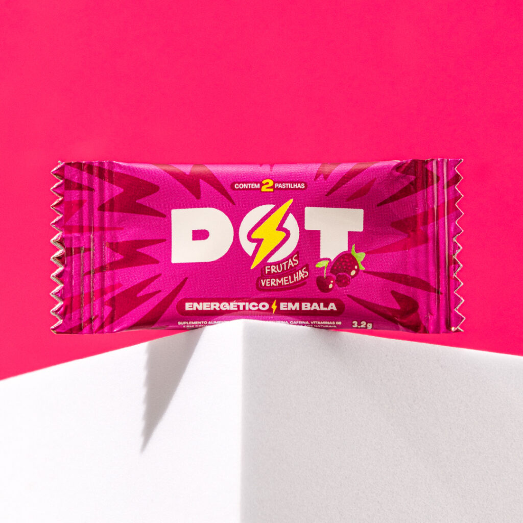
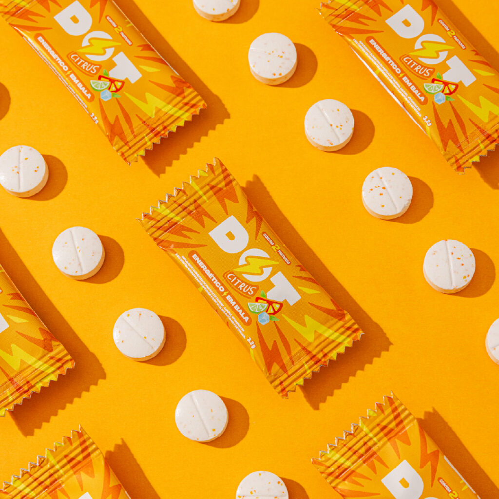
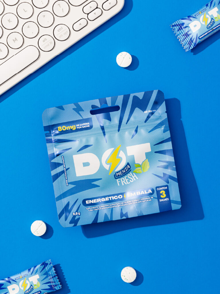
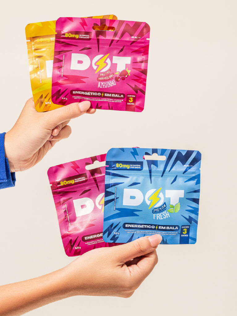
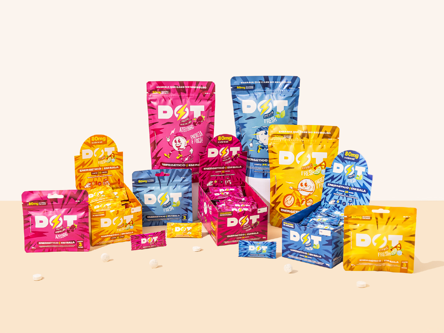
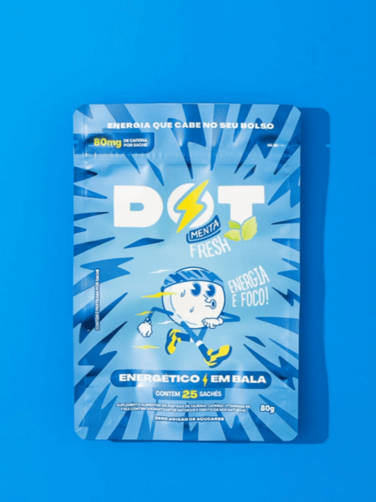
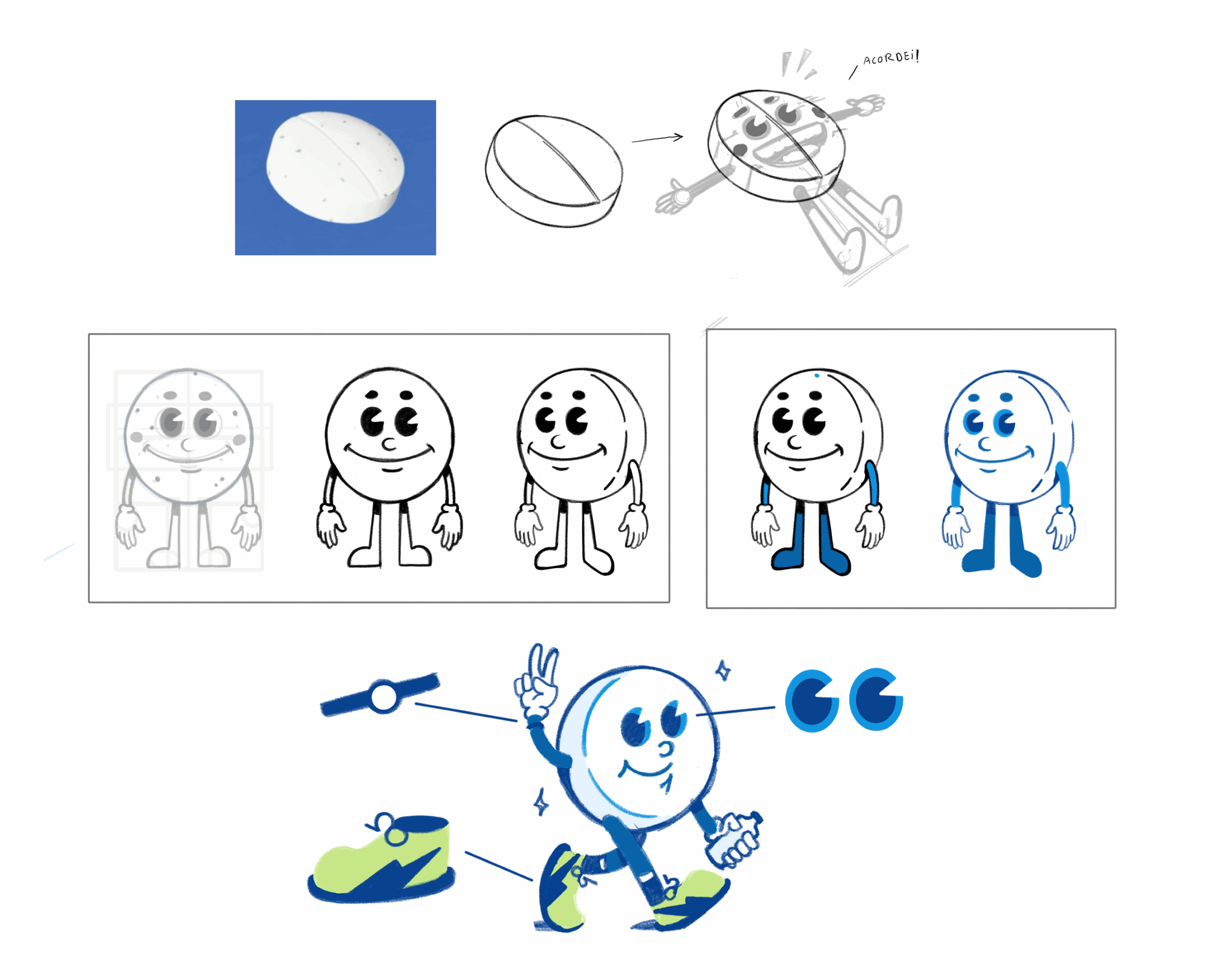
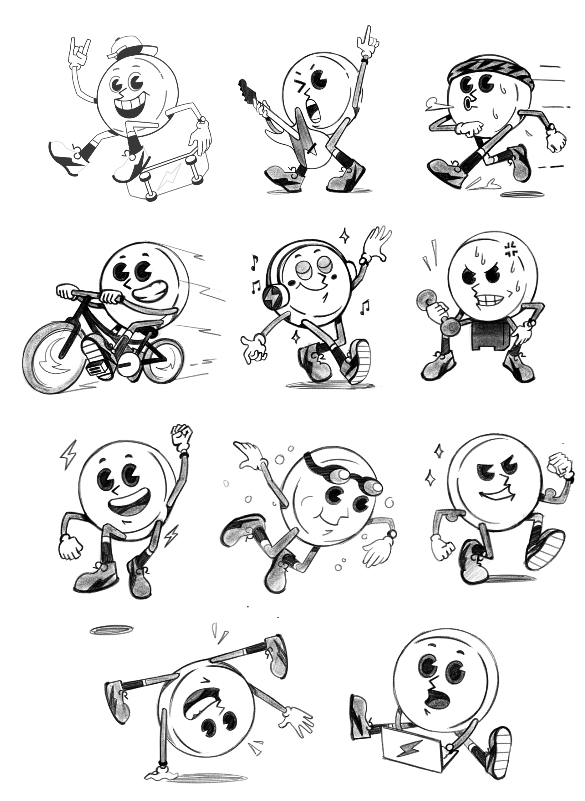
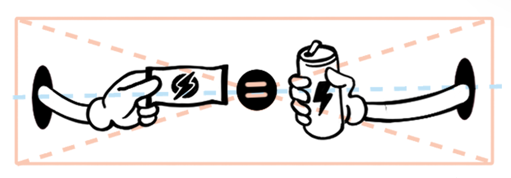
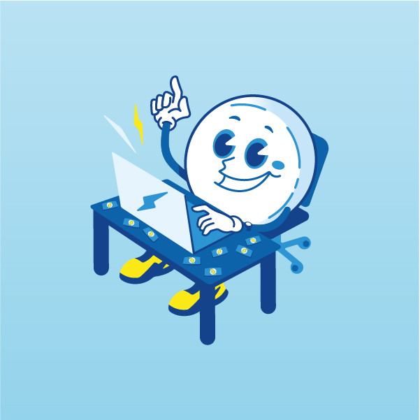
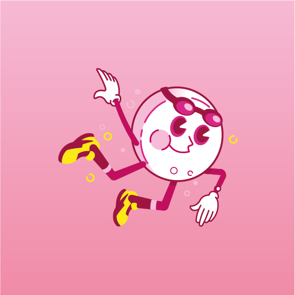
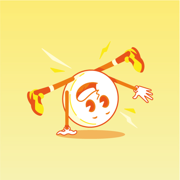
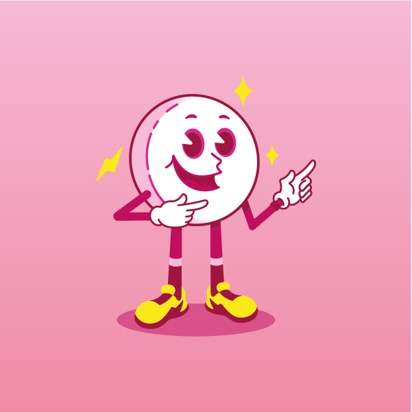
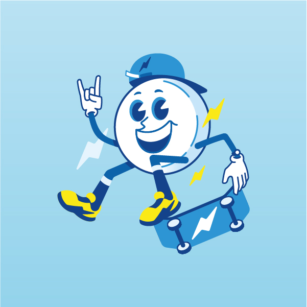
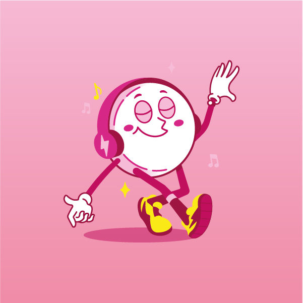
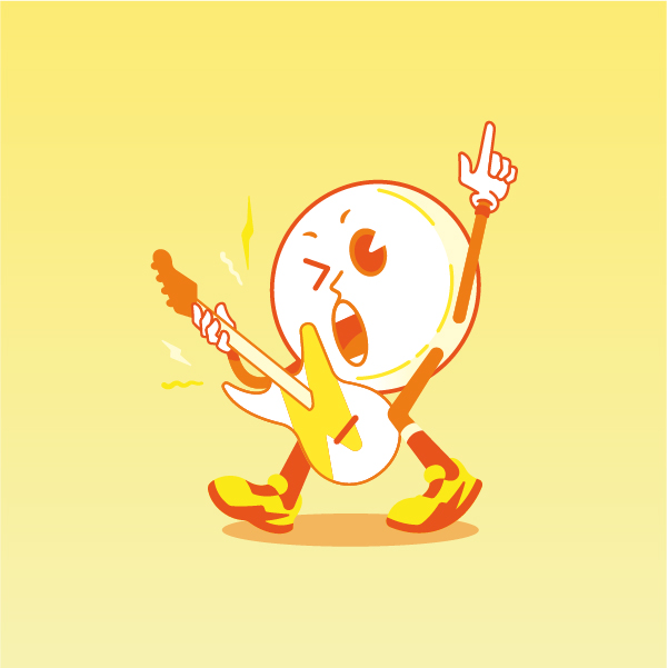
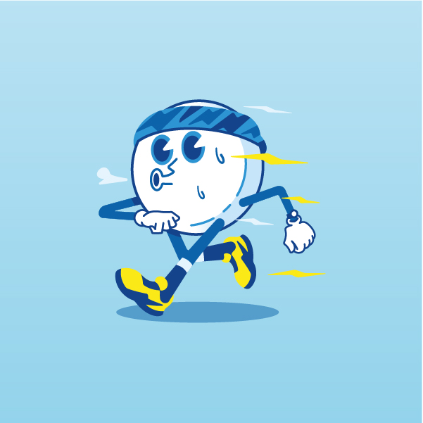
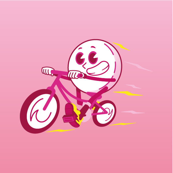
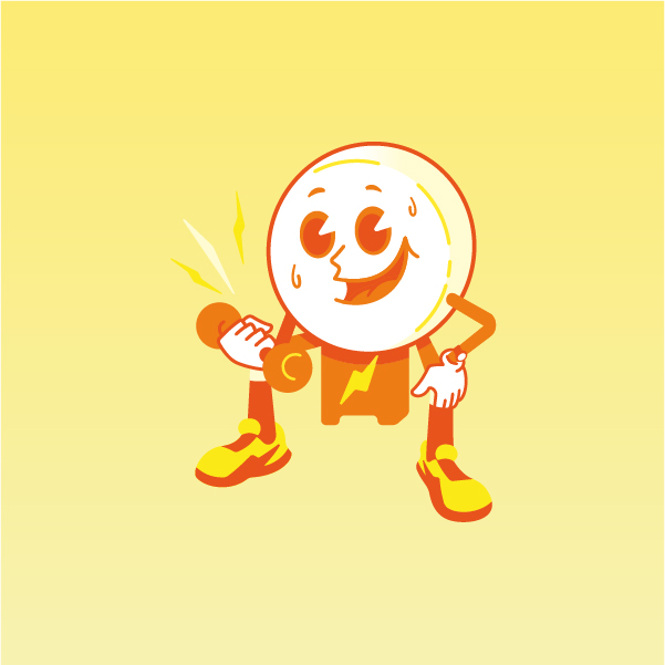
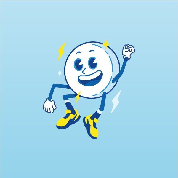
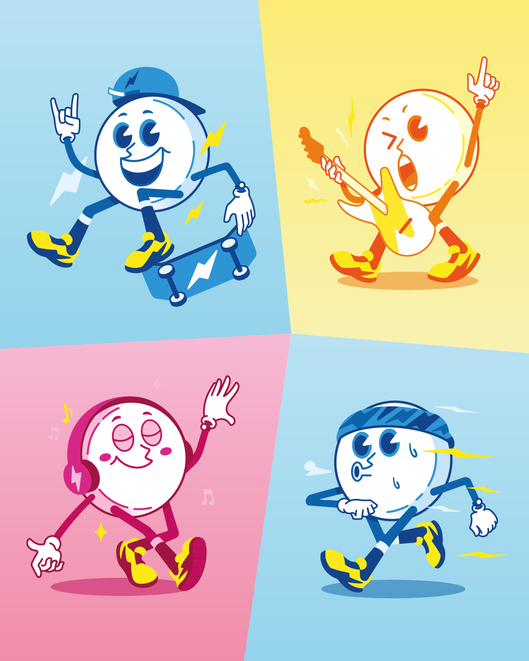
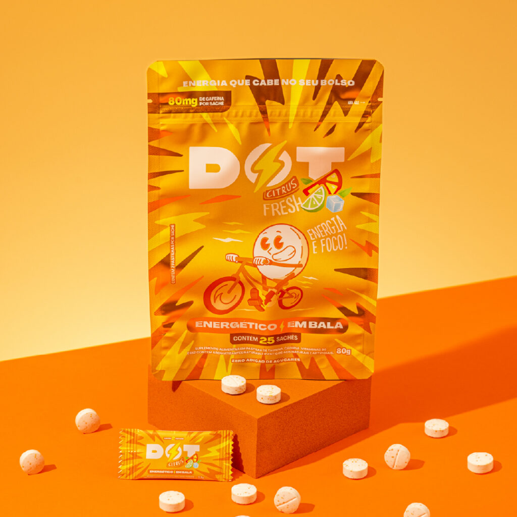
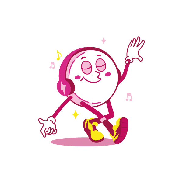
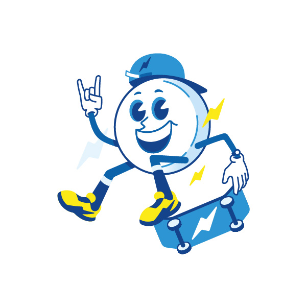
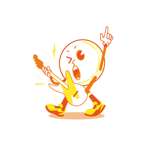
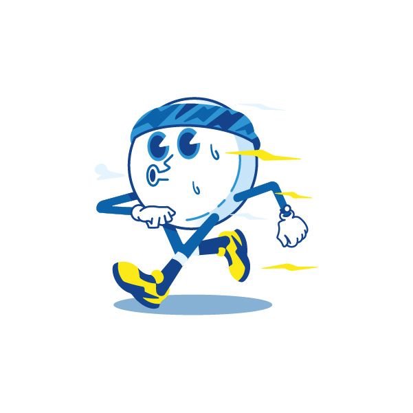
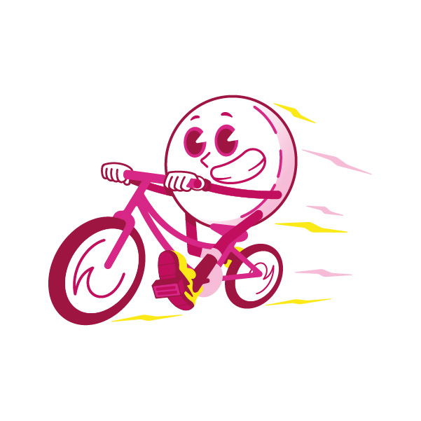
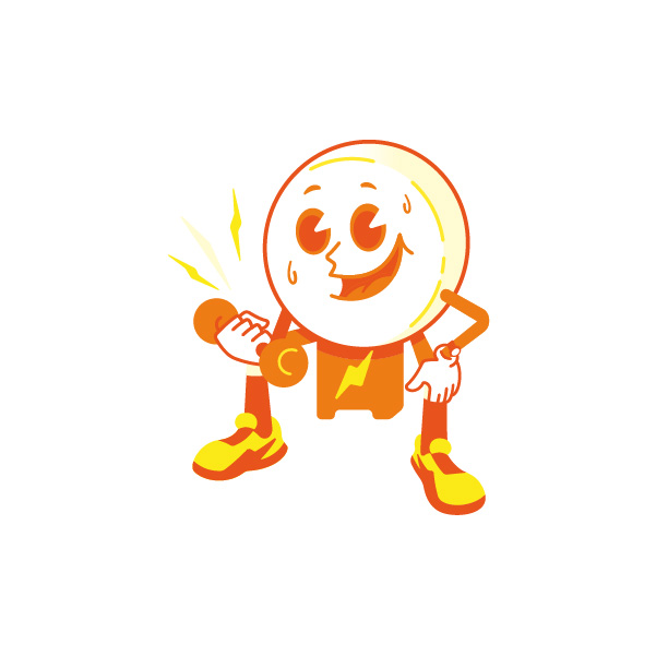
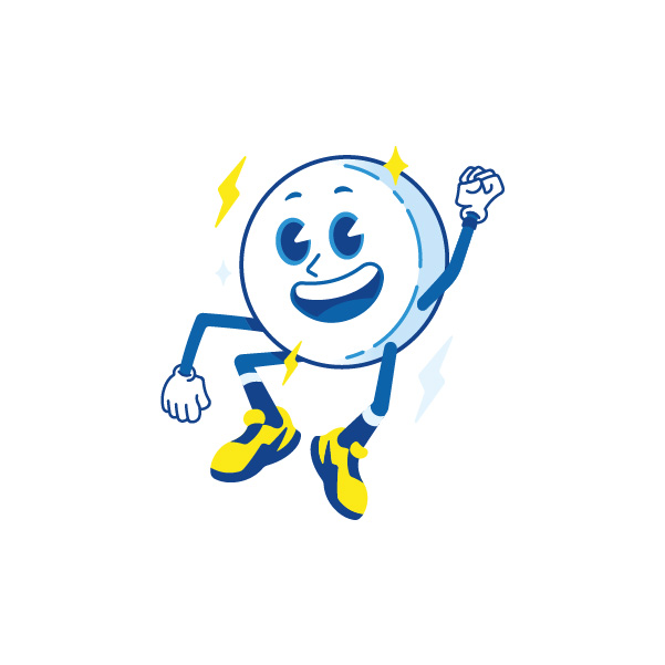
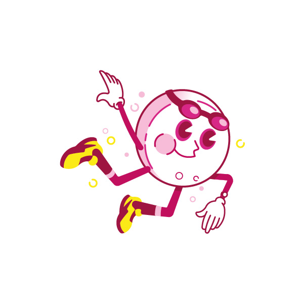
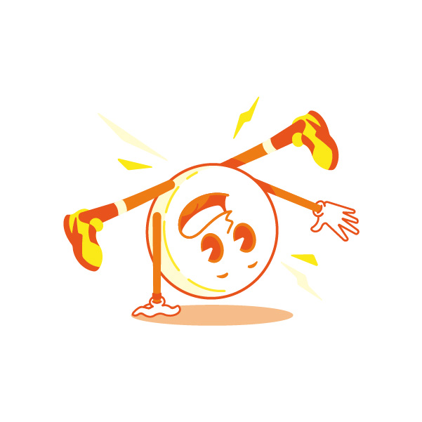
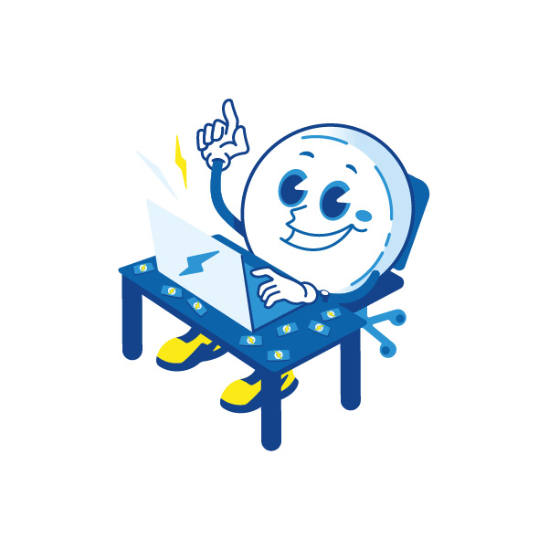
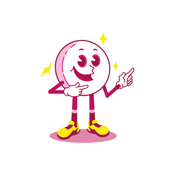
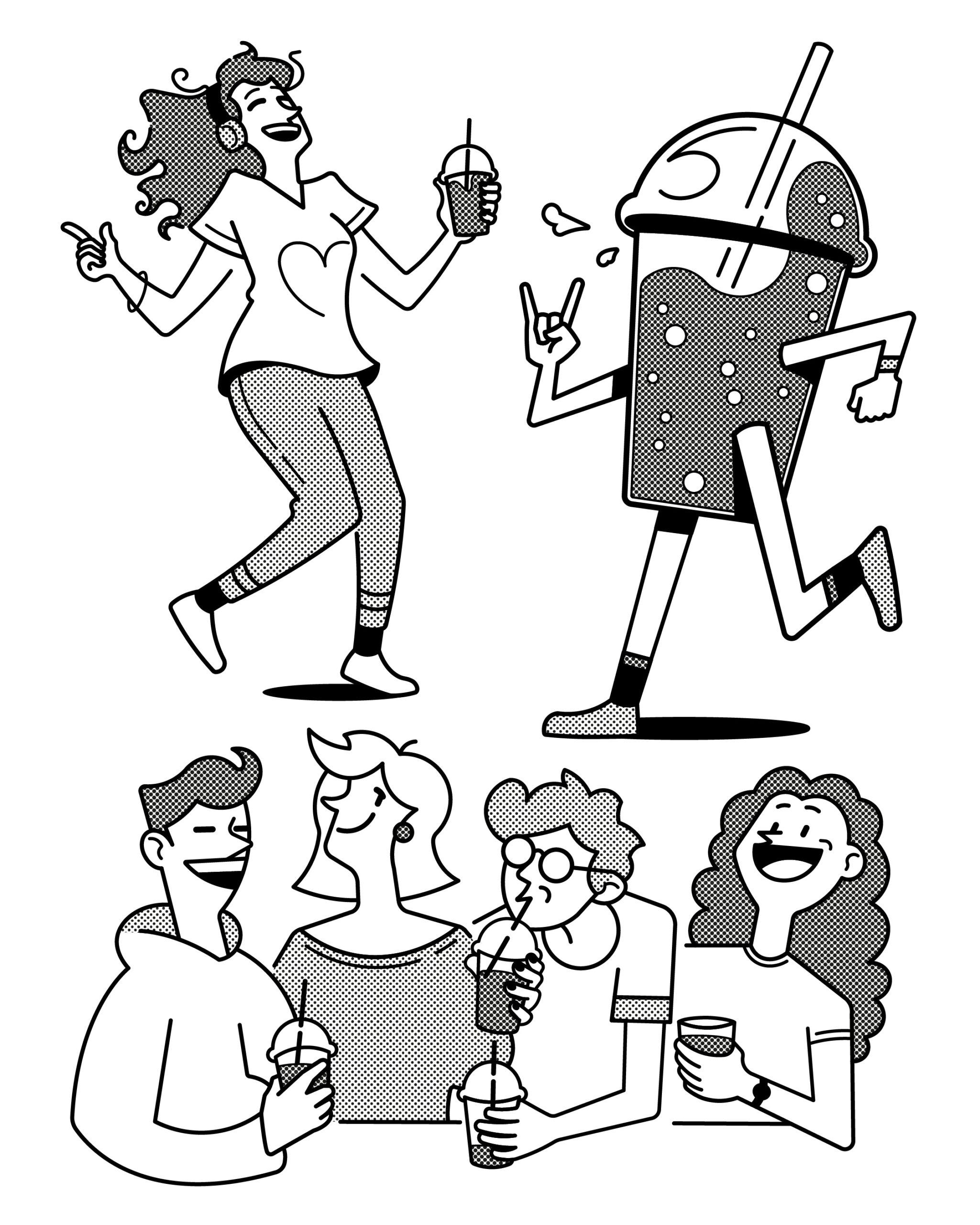
DOT Energy ⚡ Rebrand 

Invited by Raphael Iglesias, I collaborated on the illustrations for the visual identity and packaging, and developed an exclusive mascot that reinforces the brand’s dynamic and contemporary concept. Dot is an energy candy designed to deliver focus and energy in a fast, practical, and effective way, offering a simple and tasty alternative to coffee and traditional energy drinks for people with busy routines. Compact and functional, Dot was created for those who value performance and practicality, translating its essence into a modern, accessible, and playful visual identity.

Dotinho ⚡ The mascot 

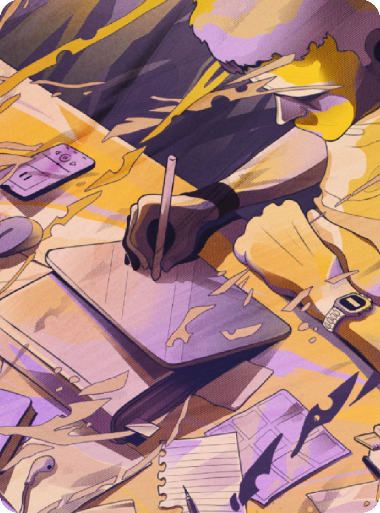
Dotinho is Dot’s mascot, created to represent energy in motion. He embodies the brand’s focus, enthusiasm, and vitality, appearing in moments that call for concentration and energy. Featured across packaging and brand communication, Dotinho brings Dot’s purpose to life, always there when it’s time to activate body and mind.

Client: Dot Energy
Creative Direction: Raphael Iglesias
Illustration: José Adriano
3D: Vitor Notário
Motion: Lukas Martins
Photography: Jordy Ribeiro

Thanks for getting here!

Share in